A game for doing more of your real life: pick an Experience, go do its Quests out in the world, tick them off with friends. I designed and launched it in three weeks.
- Platform
- Mobile-first web app, installable on iOS and Android
- Where
- Lagos first, then Nigeria and the UK
Plans die in the group chat
Everyone has a list of things they mean to do: the buka with the queue, the beach you haven't been to since school, the friend you keep promising to call. The list lives in a notes app and the plans die in the group chat.
Atuko turns that list into a game. An Experience is a themed board of real-world Quests, like Lagos Food Bingo or The Weekend Reset. You play it alone or with a crew, tick squares off as you do them, and get a bingo for every line.
- 01
Pick an Experience
A themed board of real-world Quests, like Lagos Food Bingo or The Weekend Reset.
- 02
Do its Quests in real life
Alone or with a crew, out in the world, not on the screen.
- 03
Tick them off with friends
Every square you do fills in, and every full line is a bingo.
Designer, product lead, and the person saying “ship it”
I owned the product end to end: the concept, the brand and its mascot Tuko, every screen and flow, the content of the launch Experiences, and each call on what went live.
The way I worked: see it before building it. Every big visual change started as two to four directions, side by side on real content, and I picked from those.
A visual language for real life
The first cards were collages of glossy 3D emoji stickers on flat colour. They were fun, but every card looked alike, and nothing said Lagos. I wanted each Experience to feel like a place you could step into, so I set a style brief from a reference: flat shapes, no outlines, soft backgrounds with one or two bright colours, and simple two-tone shading.
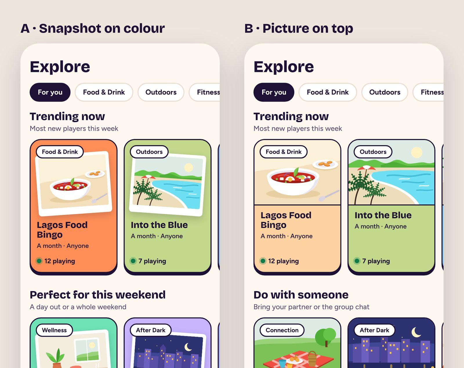
Before drawing a full set, I tested the style on real cards in two layouts. In one, the picture sits in a tilted white snapshot on the card's colour; in the other, it runs edge to edge across the top.
Two directions on real Experiences. I chose B: the picture gets the most room, and it reads as a place, not a decoration.
The system behind 32 drawings
Two scenes for each of the 16 categories, all set in Lagos: suya on the grill, a danfo, a ludo board, the lagoon.
Each Experience always gets the same scene, picked from its slug, so neighbouring cards rarely repeat and a card looks the same on every phone.
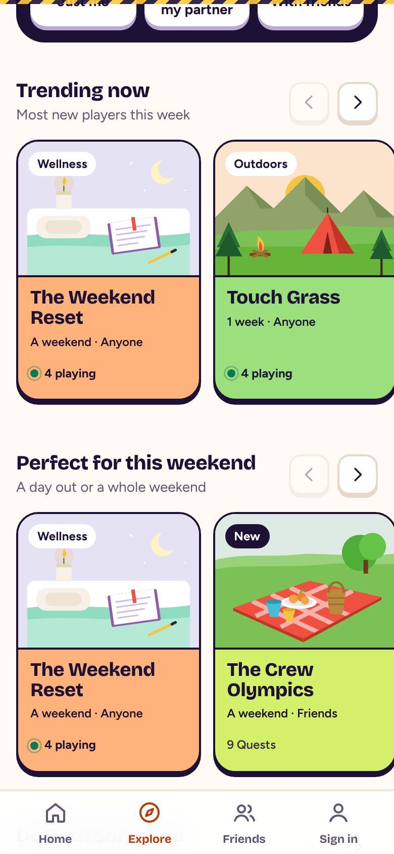
The picture follows the card's label. “Touch Grass” says Outdoors, so it shows a campsite, even though its first category is Wellness.
A creator's own photo takes the same spot, so photo cards and drawn cards look like one family.
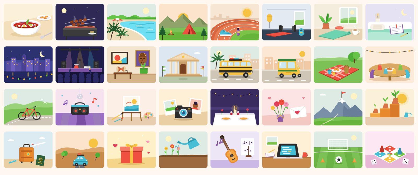
The full set. Each is a small static drawing, so cards stay fast on a budget phone.
The daily nudge
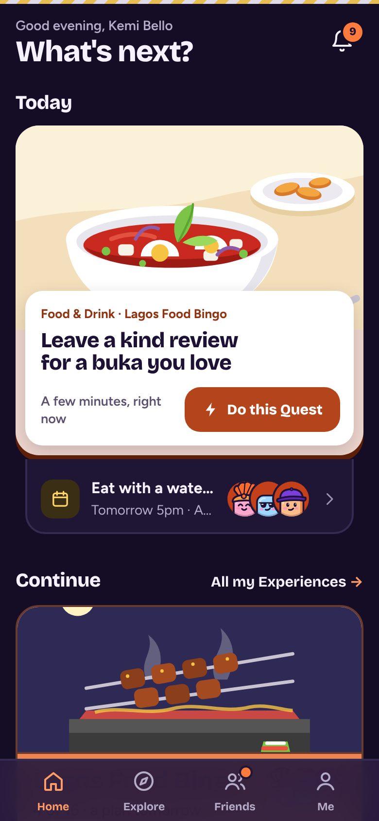
Home opens on one card: today's Quest. It's the most important tap in the app, so I explored it as four layouts with the same content.
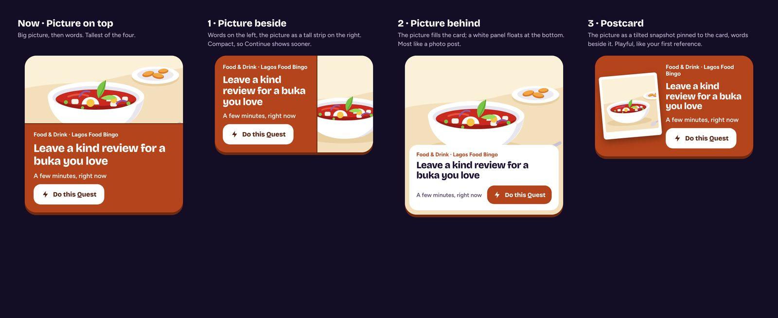
Picture on top, picture beside, picture behind, postcard.
I first built the postcard, then switched to picture behind: the drawing fills the card and a white panel floats over its bottom edge with the Quest and the button. The first build covered the subject (the soup bowl vanished behind the panel), so the panel now only overlaps the picture's edge.
One more rule came from using it: the Today card never shows the same picture as the Experience card right below it. Two suya grills stacked on Home looked like a bug.
Counting what a new player meets
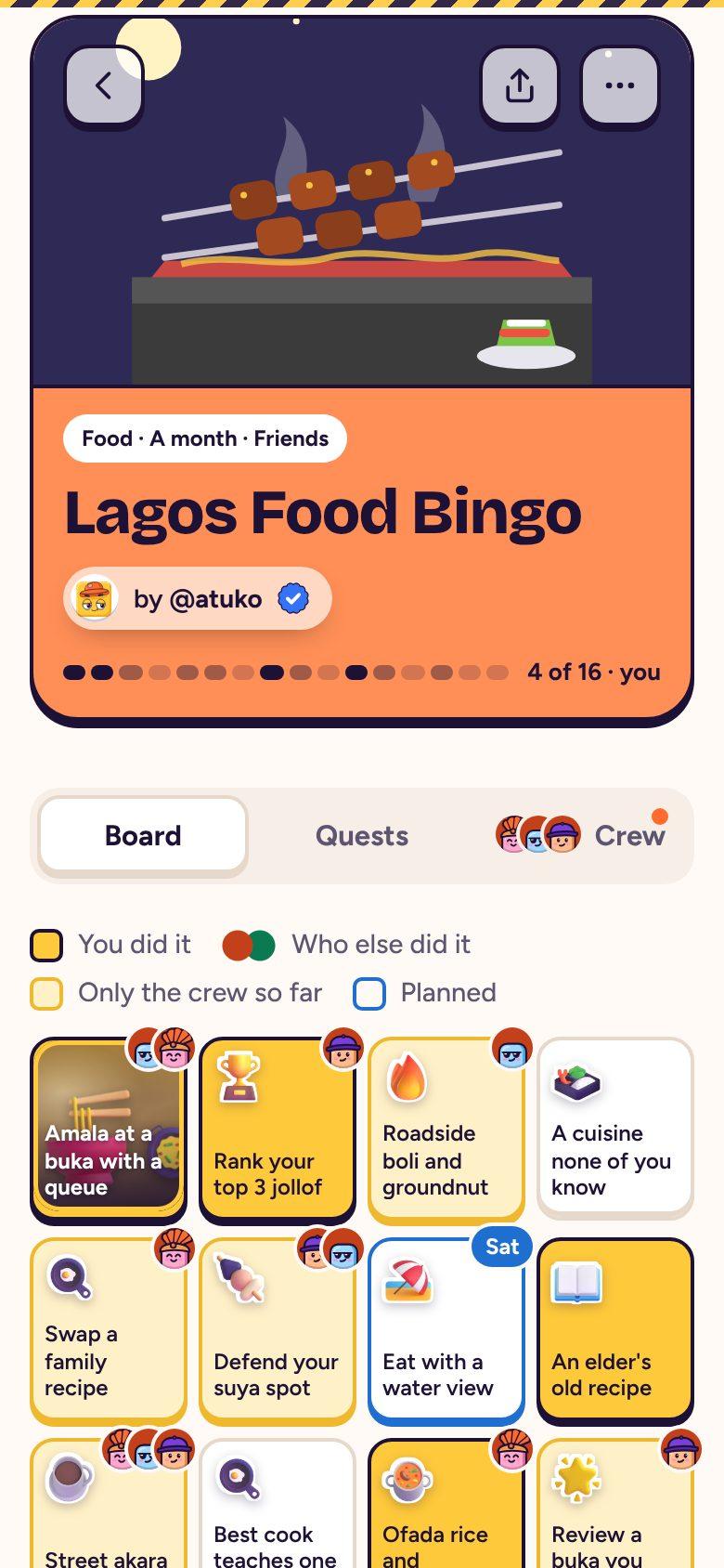
When that feedback came in, I audited what a new player actually meets. There were over 20 ideas to learn, from Wildcards and swaps to freezes and crew bingo. Six separate reward systems competed for attention: levels and XP, medals, stamps, streaks, collection tags and a leaderboard. Before pressing Play, the board was a grid of face-down “?” squares, so you couldn't see what you'd be doing.
Reward systems shown: 6, now 3 (streak, stamps, badges)
Explore page length: about 16 phone screens, now about 3, then “See all”
Me page sections: 12, now 7
Board colour key: 4 states, now 2 (you, your crew)
Quests visible before Play: 2 of 16 in full, now all 16
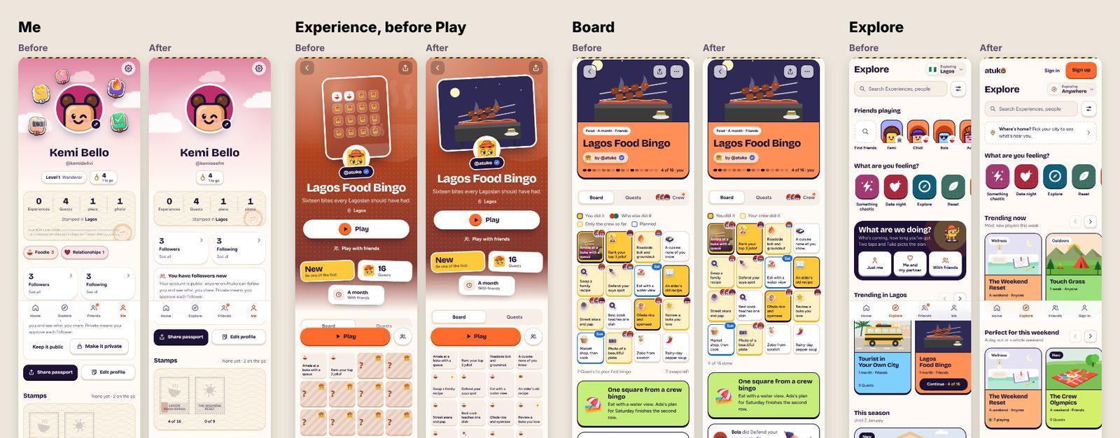
Before and after, at the same scale: Me, an Experience before Play, the board, and Explore.
Then I brought badges back
I also wrote the one sentence onto every first screen: “Pick an Experience. Do its Quests in real life. Tick them off with friends.” It's on the landing page, in sign-up and on Home before you've played.
The first pass hid medals along with levels and XP. Playing it, the app felt flat: badges were the one score that told a story (“Week Keeper”, “Friend Maker”) instead of a number. So badges came back the next day, and levels, XP and the leaderboard stayed hidden. Everything was kept behind one switch, so the call was cheap to reverse.
Details that make it feel alive
Atuko is about doing things, so it should feel physical. Taps, sheets and wins each have their own short sound and vibration, tuned so the menu stays quiet and a bingo feels like one.
iPhones don't let websites vibrate. They do give a tiny tick when a toggle switch is tapped, so every button carries an invisible switch that turns your tap into a buzz.
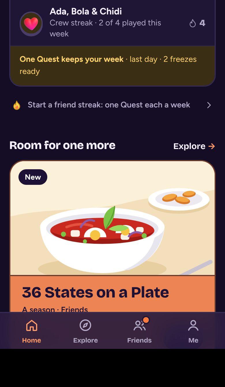
That trick had a cost I found through a screenshot: on iPhone only, one arrow on Home grew to the width of the screen. The invisible switch was being added as the last item in each button, and a style that sized “the last icon” stopped finding the arrow. I fixed it, plus five other places with the same weakness, and added an automated check so it can't come back.
Designing for honesty and safety
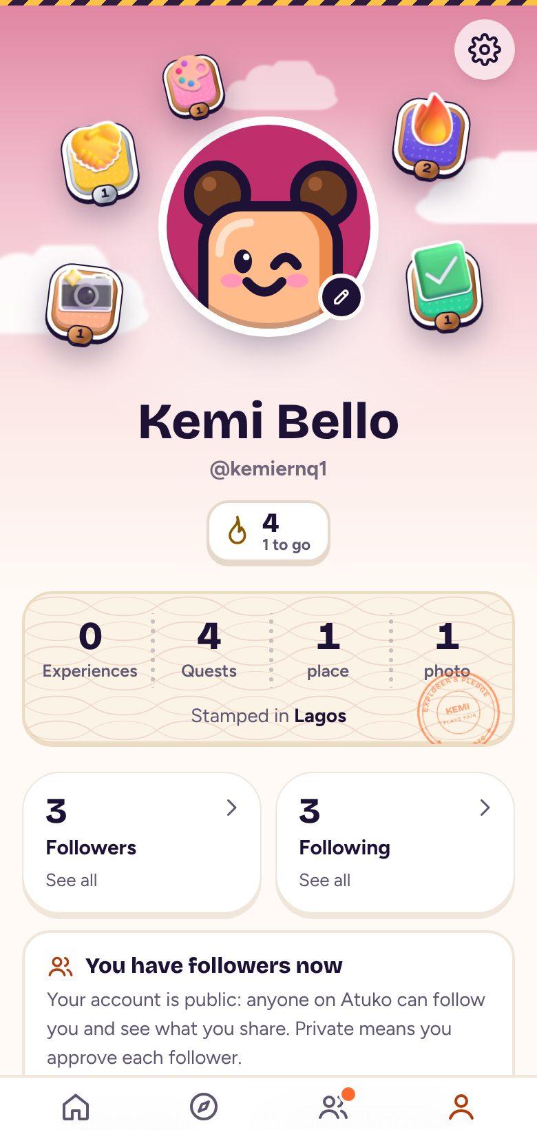
A game about real life only works if people play it honestly, so marking a Quest done is cheap but “Proved” is better. A photo taken that day, or a friend who was there, proves it and counts double. New players take a short Explorer's Pledge.
Accounts can go private, blocks cut both ways, and nudges need a real connection. When an outside security review came in, I checked every finding against the live app, fixed the two that were real, and corrected two the report had wrong.
Experiences at launch, including 10 for Fitness
Categories, each with its own colour and drawings
Hand-drawn illustrations
Shipped changes
Automated checks across the app and its data
- 01
Show directions on real content
Every choice above (the card layout, the Today card, the drawing style) was made from options side by side with real Experiences, not from a description.
- 02
Count what a new person meets
Listing every idea a first-time player sees turned “it feels confusing” into six concrete changes.
- 03
Make decisions cheap to undo
Hiding rewards behind a switch instead of deleting them meant bringing badges back took a day, not a rebuild.